Tuesday, January 10, 2012

APPLEBEE'S BOURBON ST. FACEBOOK APPLICATION

This was another simple Facebook application, and profile photo. I made these pieces as a contractor for Expion (Social Media Advertising Company). I did not develop the visual style, I just worked within the visual identity created for the campaign and adapted it to fit the new formats. I also changed and edited images, typographic elements, and created some assets to complete the project.

Wednesday, November 30, 2011

APPLEBEE'S "BREAKFAST WITH SANTA"

This was a simple Facebook advertising campaign. I made these pieces as a contractor for Expion (Social Media Advertising Company). The pieces include a Profile photo, ads, and a simple banner.


Saturday, November 12, 2011

EXPION INFOGRAPHIC: LOCAL SOCIAL

This was an interesting project. My client Expion, a social media management software company, wanted to make a piece that explained the merits of going local on social media. The whole concept, text, and some of the layout work were done by designers at Expion. I created all the assets (except for the couple in the car at the top which was from Istock) and pieces and set all the type on the piece. As you can see its highly text heavy. I worked with Expion to strip out some of the copy, but in the end they required most of it to stay. As a result the piece is a little cramped, but the format combined with the the volume of copy made this an inevitability.

Friday, March 4, 2011

BROOKLYN BETTY BRANDING

I had a client approach me with an interesting concept for an all female car service in Brooklyn NY. She already had a name, but everything else was up in the air. We talked back and forth about concepts and settled on a vintage pinup theme. With some reference images of both pinups and vintage design I went to work. The end results were in line with the look that I was hoping to achieve.


Tuesday, March 1, 2011

TOGGLE HUD / DRONE VIEW CONCEPT FOR A MILITARY FIRST PERSON SHOOTER

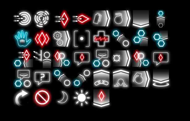
It is becoming an increasingly common tendency for "next gen" games to remove as much UI from the players view during a game as possible. Games like Dead Space, Dead Space 2, the Silent Hill series, and Farcry 2 all manage to play out without any real HUD intrusion. This is a very positive thing for most users most of the time, but it can also become a burden. Disorientation, and confusion can result. A toggle HUD, or a HUD that can be called up when needed then removed again, is a possible solution. This is a "toggle HUD" I dreamed up while at Red Storm Entertainment, and was intended for a present day military shooter. The style took its cues from modern military displays as seen in planes, tanks, and the like.


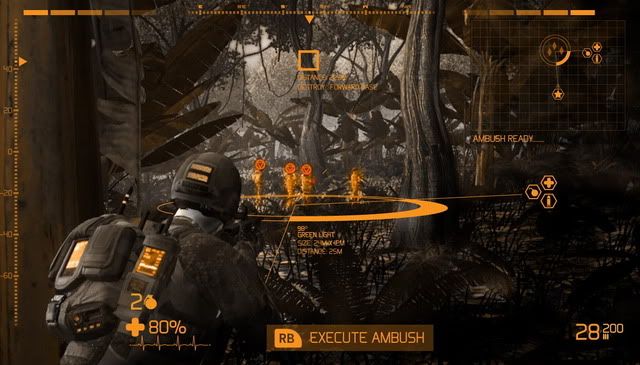
This second image is another way to remove a lot of persistent information from the HUD freeing more screen space and yielding player immersion. Its a "drone" view, which gives the player a concept of their location and helps with wayfinding within the game space. Neither possible solution should be viewed as persistent, but would instead be called up by the user when they are confused or unsure.

Monday, February 28, 2011

33RD ANNUAL WARREN SUSMAN GRADUATE CONFERENCE PRINT COLLATERAL

I was contacted and asked to make 2 pieces (which later became 3 pieces) for The 33rd Annual Warren Susman Graduate Conference at Rutgers University in New York. From the start this project was challenging. They had several pages of information about the conference that they wanted fit onto one 8.5 X 11 piece of paper for their call for papers. We discussed their needs and I was able to cull some of the less important information out to make the task more realistic. The end result of the call for papers is shown below.


After the call for papers, I got to work on a "poster" for the conference that would be posted around Rutgers Campus. They had more limitations for this piece as well. They wanted to work with a size that they could print through their university printers. They settled on 11 X 14. Again They had a lot of information that they wanted to display, 4 pages to be exact. I organized and prioritized the information, and created the piece shown below. Turnaround time for these pieces was very fast, about 1-2 days for each. All photography was taken, and edited by me.


Tuesday, January 18, 2011

SCI-FI SHOOTER 64 PIXEL ICON SET

This is an icon set I made for a game project while at Red Storm Entertainment. I am not going to go through all the icons meanings, and many are highly abstract simply because the concept they represent is also highly abstract. Some of the Icons also use a visual language that is already established throughout the rest of the game. The concept behind the icons was a clean simple look that referenced a backlight or projection based display system.