Wednesday, December 15, 2010

DUKE MEDICAL POSTER AND MAILER

I did some freelance work through a local design firm located in Durham, called Flywheel. They had some extra work they needed done quickly so they asked for some help. This project took 3 days. After the first day I submitted a draft, and the Duke client came back with some suggestions, and then I made an iteration that looked very similar to this, and they asked for a few final tweaks and this is the end result. Both pieces are off being printed now and I will update with pictured of printed pieces when they are available.

**UPDATED**

The first run came in from printers. One image changed due to a resolution issue. These are the final versions, and will be distributed at Duke Hospital.


CAROLINA SOUTHERN REALTY - BUSINESS CARDS

This project is a more recent example of the freelance work I have been doing. I took all the photography and created the cards from scratch with the exception of the Logo, which they wanted to continue using. The cards were made in Illustrator and Indesign CS5 and printed by Vistaprint.com.


Monday, October 4, 2010

HUD INTERFACE FOR A INTERACTIVE FPS GAME V2.

Like my earlier post, this was another concept for a visual direction for the HUD of a FPS game. This aesthetic is more referential of specific display technologies. More specifically, OLED, LED, signboards, and lcd displays.


SRI LANKA TYPE FACE

I created this type face to look like the written Sri Lankan language, while still being readable as english. I used lots of reference and tried to mimmic shapes that I saw in their letter forms. The result is a face that clearly looks foreign, but if you look closer there are clear definable letterforms that can be seen.


Sketches of the first draft of the letter forms, with annotations.

The quick brown fox jumps over the lazy dog.

HUD INTERFACE FOR A INTERACTIVE FPS GAME

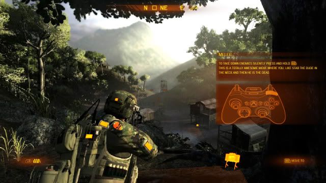
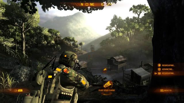
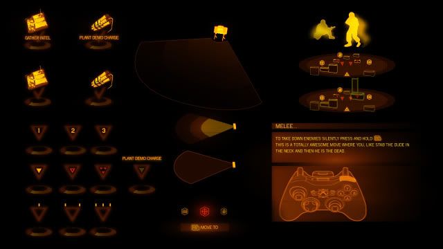
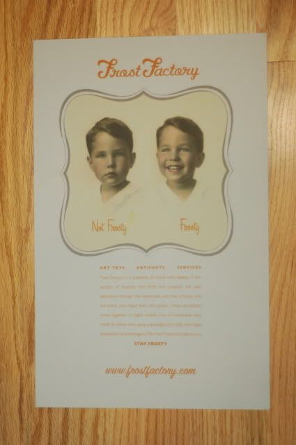
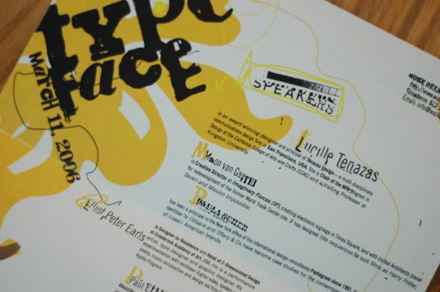
This is a more recent concept that I worked on while at Redstorm Entertainment. These two screens all show parts of the same interface system in action. The look of the interface is reminiscent of older military HUDS, but feels more modern due to crisp lines and vector text. The limitations on color were part of the art direction, and although the lack of color variation helps unify the system visually, it also results in a lack of contrast among individual parts. I took this into consideration while working on this system and tried to use scale, animation, and position to help the end user find the information they needed as simply as possible.


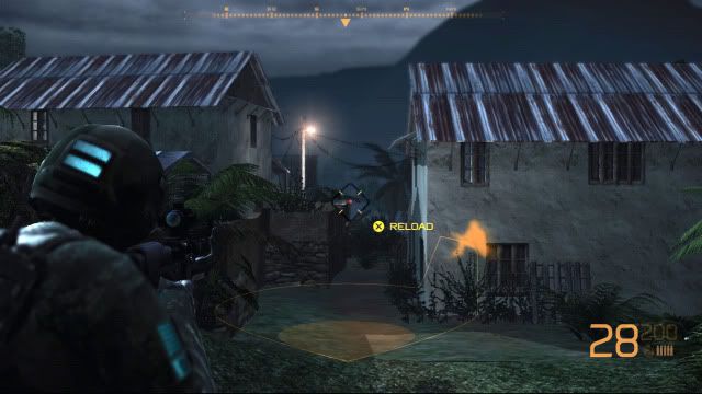
This first image shows the player character in the bottom left, and a reload prompt in the middle of the screen. Below the aiming reticule is a thin line, and a shaded area. This is a in world 3-d representation of the blast radius for a claymore explosive. Above that is the Silhouette of an enemy who has been detected behind the building on the right. At the bottom right is the persistent information that is constantly necessary for the user. The large number is the amount of ammo left in their clip, the smaller number is the total ammo they have left in supply, below that is a grenade indicator, and the firing mode they have selected, in this case full auto.


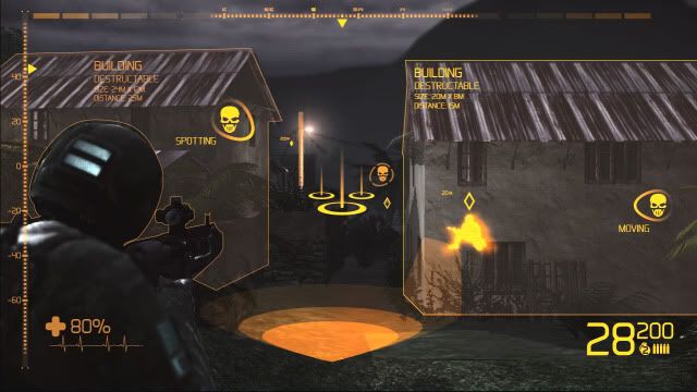
This second image is far more complex, and rich with both information, and texture. Texture in the sense that the HUD has far more visual weight, and clearly conveys a feeling of "high tech" while still being reminiscent of traditional military HUDs. This screen displays the player character's health directly on the character, and shows possible interactions that the player can experience with the world as well. This screen was intended to be used as a "toggle hud" which could be accessed by the user when they needed additional information about the game world that wasn't always pertinent to display. This separation between persistently displayed information and context specific / user accessed information allows for the HUD to remain simpler during most situations.

Wednesday, September 29, 2010

FROSTY POSTER

This poster was one of several for Frost Factory, a toy company started by a friend of mine and myself. The company is still a work in progress, but this poster was used in smaller form as a postcard for out first show at Phoenix Tattoo in Raleigh NC.


This is concept for a flashlight that is also a road flare. There tons of problems with traditional "burning flares" and all the electric flares on the market are awkward, bulky, and limiting. I wanted to make a device that charged while the car was in use, and was ready in case of an emergency. The fit of combining a flashlight and road flare seemed obvious to me, since both are necessary in any roadside hazard kit, and both are primarily light emitting devices. The end result for me was the safe light.


CAMPING MAT CONCEPTS

These are a few of the concept camping sleep surfaces that I developed. The idea was to make them light, portable, and comfortable. I looked towards nature for inspiration, focusing on the tail of a scorpion, and the way the segments fold onto themselves.


Tuesday, September 28, 2010

SPEAK MAGAZINE

Speak magazine is a fictitious publication that has multiple seemingly disjointed texts that come together as you read through the piece. The driving voice of the publication is one of environmental and social awareness.


TYPE FACE MAILER

This was a simple mailer that I created for a conference about hand drawn typography. The conference was titled "Type Face" and was to feature many well know designers. All the type on the mailer was printed cut up photocopied, and manipulated out side of the computer, and then rescanned. This mailer never went to print.


INFORMATION PACKET FOR CONFERENCE

For this project I designed a information packet for an environmental conference. Inside there is a sign up form, a schedule, a sponsor section, and event information. I was responsible for the organization of content, the form of its presentation, and the actual presentation of the end artifact.


Sunday, September 26, 2010

SPECIMENS SERIES BOX PLAQUE

These plaques were designed in Adobe Illustrator, rasterized, and cut on a CO2 Laser Cutter out of Basswood. They were designed to be affixed to a box for a toy series that I was working on at the time. I have come to enjoy this specific piece more on its own, as opposed to mounted on the toy box its self.


TRACKPAD / MOUSE HYBRID IMPUT DEVICE

This rendering is of a concept input device designed for someone who switches between a trackball, and a traditional mouse. The concept is simple enough. The ball in the center guides the cursor on the screen like a "Old School" traditional ball mouse, but the ball can also be raised off the table its being used on, and in that case the device becomes a stationary, stable platform to be used as a trackball.

NEW BLOG SMELL!

This new blog is up and operational in the hopes that I can use it to explore my past through current design work, and concentrate it in one location in order to make it more accessible for potential employers, friends, and colleagues. The first few weeks or so will posts of older work in order to catch up with the present. Lets start with some photos. More can be found here at my FLICKR account.